| View previous topic :: View next topic |
| Author |
Message |
Darren
Frequent Visitor

Joined: 11/07/2002 14:36:40
Posts: 23848
Location: Hampshire, UK
|
 Posted: Thu Sep 27, 2012 8:39 am Post subject: Study shows that typeface choice has safety benefits Posted: Thu Sep 27, 2012 8:39 am Post subject: Study shows that typeface choice has safety benefits |
 |
|
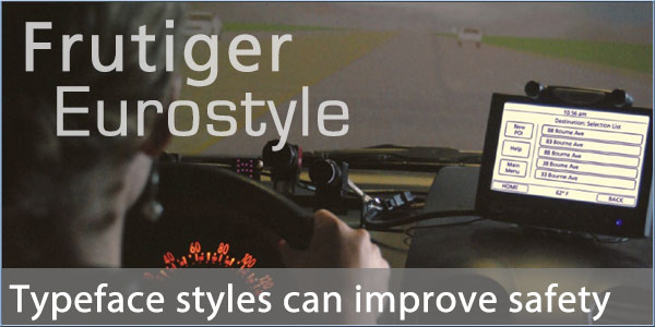
Research conducted by the Massachusetts Institute of Technology and Monotype Image Holding Inc has demonstrated that certain typeface styles can reduce the glance time for driver information systems.
Studies demonstrated that there was a marked and consistent reduction in the time spent looking at information displays when they used certain typeface styles.
With the increase in information presented to drivers from navigation, driver information and multi-media systems, the results make interesting reading. At highway speeds, the reduction in time spent absorbing information equated to a distance travelled of 50 feet.
Monotype's Frutiger typeface produced the best results in the test, conducted with 82 participants aged between 36 and 75.
Source: MIT Age Lab
_________________
Darren Griffin |
|
| Back to top |
|
 |
M8TJT
The Other Tired Old Man


Joined: Apr 04, 2006
Posts: 10118
Location: Bexhill, South Sussex, UK
|
| Posted: Thu Sep 27, 2012 9:21 am Post subject: Re: Study shows that typeface choice has safety benefits |
|
|
| News Team wrote: | Research conducted by the Massachusetts Institute of Technology and Monotype Image Holding Inc has demonstrated that certain typeface styles can reduce the glance time for driver information systems.
Monotype's Frutiger typeface produced the best results in the test, conducted with 82 participants aged between 36 and 75. |
Well I suppose that it would be a Monotype font, wouldn't it?
The choice of font for readability has been a well known fact since newspapers became common. Serif fonts are easier to read in big blocks of text (hence 'Times Nwe Roman') and sans serif fonts have more impact as 'headlines'.
ALL CAPS IS CONSIDERABLY MORE DIFFICULT TO READ IN LONG SENTENCES, ESPECIALLY IN LARGE BLOCKS. THAT ALSO DOESN'T TAKE INTO CONSIDERATION THAT IT IS GENERALLY ACCEPTED TO BE THE TYPED EQUIVILENT OF SHOUTING.
What I also find is that the choice of colours is arguably more important than tht choice of font. For instance the Sygic Traffic uses red typeface on a black background for their delays (which don't work anyway). This is impossible to read at a small font size at normal phone distances, let alone whilst driving. I can't understand why people think that red is a good colour for warning text, especially against a dark background as it is particularly difficult to read for the normally sighted let alone those with red/green colour blindness. |
|
| Back to top |
|
|
navtrav
Regular Visitor

Joined: 03/01/2003 19:00:24
Posts: 122
Location: United Kingdom
|
| Posted: Fri Sep 28, 2012 9:51 am Post subject: |
|
|
As a former newspaper page designer, I have been involved in quite a few redesigns and I totally agree with M8TJT.
I am also in agreement about the importance of colour (interesting that the majority of newspaper headlines are still black) and especially Sygics poor design.
While I like their maps, the information bar is very poor, even worse if you click on it for the further menu. Ive learnt the position of cancel route because I cannot read it.
Even knowing where it is, it is too small. Invariably Im trying to hit it to stop the annoying, re-routing do a u-turn nag when I know better) only to find Ive hit the wrong choice and I then need to stop the car and do a complete reset.
I found even if I switch the phone off, the app keeps going with its annoying verbal nag. I have to exit the app not an easy thing to do with the small menus when trying to concentrate on the road.
Yes, a poor design.
_________________
Tim
------------
Samsung Galaxy S4, Galaxy Tablet S, TomTom. Osmand+ and Sygic. Ex-TomTom Go 1000 Live, ex-TomTom Go 700, ex-TomTom truck, ex Navman/Ipaq |
|
| Back to top |
|
|
peterc10
Frequent Visitor

Joined: Aug 21, 2005
Posts: 1761
Location: Kent, England
|
| Posted: Fri Sep 28, 2012 10:26 am Post subject: |
|
|
All of this was known over 50 years ago when the UK's motorway system and its traffic signs were being designed. Been some interesting TV programmes recently (on BBC4 I think) on how the design was developed and the choice of colours, fonts etc.
_________________
Peter
HTC Sensation
Sygic GPS for Europe (No more TT "support"!)
Copilot for USA
Bury CC9060 bluetooth car kit & Brodit mount |
|
| Back to top |
|
|
MaFt
Pocket GPS Staff


Joined: Aug 31, 2005
Posts: 15408
Location: Bradford, West Yorkshire
|
| Posted: Fri Sep 28, 2012 10:45 am Post subject: |
|
|
| peterc10 wrote: | | Been some interesting TV programmes recently (on BBC4 I think) on how the design was developed and the choice of colours, fonts etc. |
I saw the first one - pretty fascinating actually!
MaFt |
|
| Back to top |
|
|
peterc10
Frequent Visitor
Joined: Aug 21, 2005
Posts: 1761
Location: Kent, England
|
| Posted: Fri Sep 28, 2012 10:55 am Post subject: |
|
|
The first one was dedicated to the signs I think and yes it was fascinating. And then parts of it were included in the history of motorways series they also ran.
_________________
Peter
HTC Sensation
Sygic GPS for Europe (No more TT "support"!)
Copilot for USA
Bury CC9060 bluetooth car kit & Brodit mount |
|
| Back to top |
|
|
M8TJT
The Other Tired Old Man
Joined: Apr 04, 2006
Posts: 10118
Location: Bexhill, South Sussex, UK
|
| Posted: Fri Sep 28, 2012 11:22 am Post subject: |
|
|
So what we can gather from this is that Monotype's 'recent discovery' isn't recent, is just a sales ploy  |
|
| Back to top |
|
|
66Mustang
Lifetime Member

Joined: Jan 31, 2004
Posts: 43
Location: Northampton, England
|
| Posted: Fri Sep 28, 2012 1:44 pm Post subject: |
|
|
| Basically, yes. Jock Kinnear and Margaret Calvert came up with 'Transport' and 'Motorway' fonts for that very reason. Lower case is preferred as the shape of the word is what you recognise from a distance rather than reading it. |
|
| Back to top |
|
|
Andy_P
Pocket GPS Moderator


Joined: Jun 04, 2005
Posts: 19991
Location: West and Southwest London
|
| Posted: Fri Sep 28, 2012 1:48 pm Post subject: |
|
|
Maybe Comic Sans isn't so bad after all!
It's one of the few fonts that has an "a" in the same shape that every child learns to write it.
_________________
"Settling in nicely" ;-) |
|
| Back to top |
|
|
navtrav
Regular Visitor
Joined: 03/01/2003 19:00:24
Posts: 122
Location: United Kingdom
|
| Posted: Fri Sep 28, 2012 1:54 pm Post subject: |
|
|
| 66Mustang wrote: | | Basically, yes. Jock Kinnear and Margaret Calvert came up with 'Transport' and 'Motorway' fonts for that very reason. Lower case is preferred as the shape of the word is what you recognise from a distance rather than reading it. |
Yes, my past font research also suggested that you can still recognise words with the 'descenders' covered up, but it's harder with the 'uppers' covered.
_________________
Tim
------------
Samsung Galaxy S4, Galaxy Tablet S, TomTom. Osmand+ and Sygic. Ex-TomTom Go 1000 Live, ex-TomTom Go 700, ex-TomTom truck, ex Navman/Ipaq |
|
| Back to top |
|
|
M8TJT
The Other Tired Old Man
Joined: Apr 04, 2006
Posts: 10118
Location: Bexhill, South Sussex, UK
|
| Posted: Fri Sep 28, 2012 4:21 pm Post subject: |
|
|
| navtrav wrote: | | Yes, my past font research also suggested that you can still recognise words with the 'descenders' covered up, but it's harder with the 'uppers' covered. |
In my extreme youth around the late 40s/50s, I had a book called The Wonder Book Of Why And What. This demonstrated the decenders/risers problem nicely. Also you can mix up the leterts in wodrs and they can still be ealesy be read if the first and last letters are rihgt. |
|
| Back to top |
|
|
adm143
Occasional Visitor
Joined: Jan 20, 2009
Posts: 9
|
| Posted: Sat Sep 29, 2012 6:54 am Post subject: |
|
|
| M8TJT wrote: | | navtrav wrote: | | Yes, my past font research also suggested that you can still recognise words with the 'descenders' covered up, but it's harder with the 'uppers' covered. |
In my extreme youth around the late 40s/50s, I had a book called The Wonder Book Of Why And What. This demonstrated the decenders/risers problem nicely. Also you can mix up the leterts in wodrs and they can still be ealesy be read if the first and last letters are rihgt. |
http://www.dailywritingtips.com/cna-yuo-raed-tihs/ |
|
| Back to top |
|
|
M8TJT
The Other Tired Old Man
Joined: Apr 04, 2006
Posts: 10118
Location: Bexhill, South Sussex, UK
|
| Posted: Sat Sep 29, 2012 9:17 am Post subject: |
|
|
Thanks adm143. I actually looked for that before I posted my last, but couldn't find it  |
|
| Back to top |
|
|
|
![]() Posted: Today Post subject: Pocket GPS Advertising Posted: Today Post subject: Pocket GPS Advertising |
|
|
We see you’re using an ad-blocker. We’re fine with that and won’t stop you visiting the site.
Have you considered making a donation towards website running costs?. Or you could disable your ad-blocker for this site. We think you’ll find our adverts are not overbearing!
|
|
| Back to top |
|
|
|